Follow the trail: The path to conversion in the Outdoor Clothing eCommerce sector
Our latest Search report into Outdoor Clothing retailers showed the enormous impact site speed has on the user experience – and a company’s bottom line. But site speed is only one feature that visitors will encounter as they journey through your website.
In this blog, we’ll look at some other all-important UX factors that, when optimised, provide users with a seamless and easy-to-follow trail towards conversion.
Site speed is an influential factor in determining whether users stick with a website or give up and move onto a competitor’s site instead. But, it is only one item in a (very) long list of factors that websites can be optimised to improve user retention and conversion. The science of UX & CRO is all about understanding your users’ motivations, emotions and concerns – then translating that into clever copy, design and good old usability that will capture their attention and clicks.
So, how to begin scaling such a mammoth task? Well, we’ve looked at a few crucial points that appear on the route of any eCommerce user journey, with examples of how leading Outdoor Clothing brands use site search, filters and messaging to keep users on the path towards conversion.
Let’s a take look!
Don’t make users search high and low
Website visitors that use site search are more likely to convert than a visitor who doesn’t use site search. In our experience, we also typically see a strong percentage of revenue coming from site search users. That’s because these users typically have something particular in mind they are looking for – and that’s why you need to make sure your search results get them to that place (otherwise, they might assume you don’t have that thing they’re looking for and move on elsewhere).
To get site search into tip-top shape, and reduce the risk of users abandoning your site when they don’t see the results they expected, there are a few best practices to follow:
- Always return search results – there should be no dead ends to a search
- Make the search box prominent and visible – on desktop AND mobile
- Use auto-suggestions as people type in their search
- Auto-correct spelling mistakes in search
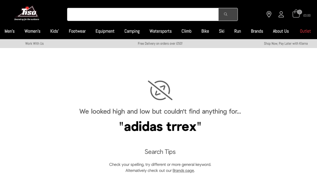
In this example from Tiso, there is plenty of scope to enhance site search by incorporating all of those best practices. Despite stocking Adidas TERREX walking shoes, a misspelt search doesn’t point you to the right product as you type in your search query.
The search results could also better guide users to what they’re looking for – either through showing related products or including links to category pages like brands (where Adidas can be found) or footwear.
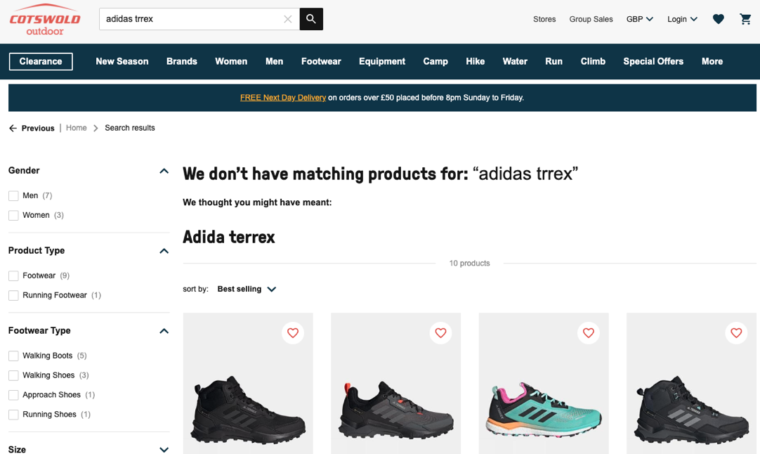
Contrast that to Cotswold Outdoors, which gets users back onto the beaten track even if they’ve made a slight mistake – in this case, by identifying what a user meant to look for and getting products right in front of them!
Help users navigate themselves to their destination
We all know that filters on product listing pages are one of, if not the best, controls for finding a perfect product match. Despite that, research has shown that poor filtering experiences blight up to a third of even the biggest eCommerce brands.
Before we get onto a few general rules of thumb when it comes to filters, it’s important to touch on what filters should be included. It isn’t necessarily a case of “the more filter options, the better” – especially as more filters can make discovering products tricker on mobile devices, where browsing is already fiddlier.
There are some basic criteria that users will always want to filter by when it comes to outdoor clothing (size, price, category, colour), but some websites like GoOutdoors have much more extensive filter options. As an example, their Men’s Coats & Jackets page has 14 filter options, including new season items, brochure items, sustainable materials and the Duke of Edinburgh Award recommended kit!
In finding the most useful and appropriate filters to include on your site, user research will help you to work out how users look for and discover products on your site, what kinds of factors might be important to include as filter options and if the filter options present make sense to them. Engagement with filters should also be tracked to understand which ones are used the most (and should be elevated up the page) and any that are less commonly interacted with and could be removed, renamed or replaced.
As for a couple of best practices with filtering:
- Make it obvious to users what filter options have been selected
- ….and that the products that are being displayed have been updated to match the selected options
- Allow multiple filter options to be selected at the same time
- Show how many products are associated with each filter option
- Don’t overlook the filter experience on mobile!
Filters are definitely an area where a lot of Outdoor Clothing brands could vastly improve their user experience, but one brand that is incorporating these best practices relatively well is columbiasportswear.co.uk.
The mobile experience is pretty good too, with users being able to see all the filters available and only expand those that they’re interested in selecting from.

Offer the right messages at the point of conversion
Once a user has landed on a specific product page, we can assume their interest in that product is somewhat piqued and there is intent to purchase. But, interested as that user may be, brands can’t rest on their laurels and assume that a sale is in the bag – helpful reminders of why a user should buy from you (rather than consider a competitor) are often impactful in convincing users to click.
Let’s take Snow + Rock as an example:
On its product pages, Snow + Rock reiterates its value proposition and lists out some reasons to buy with them right underneath its Add to basket button. This cleverly situated position means that users, at the point of hovering over that button, are reminded and reassured of why Snow + Rock is the website they should go with.
The same benefits are also visible again once a user moves to their basket before heading to checkout.
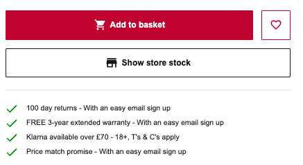
In this case, Snow + Rock amplifies its generous returns policy, price matches and 3-year warranty, but websites can include any benefits or USPs that users might be attracted by – whether that’s free shipping, express delivery, or a product’s charitable/environmental credentials. Again, this can also be where user research comes in handy to work out which aspects of your offering you should be advertising to deliver an uplift in conversions.
3 focus points for improving the path to conversion
And there you have it!
Each of these touchpoints – site search, filters, product page messaging – are important parts of the route that leads users to the point of conversion. By optimising these aspects, in particular, it becomes much easier for users to follow the trail of the intended user journey and not get lost in the woods of a poor user experience.
Thinking about how you can improve your own site’s user journey?
Get in touch with our expert team of CRO & UX specialists who can help you take a customer and data-driven approach to optimisation.
Request a free copy of our Outdoor Clothing Search Competitor Insight Report, here.
Ready to connect?
Please submit your details and as much information as you can about what you would like to discuss:
required information